The Shift That Already Happened
A few years ago, building a “mobile-friendly” website was optional. It was a nice add-on, something businesses did to keep up with trends. That time is over.
Today, smartphones dominate the way people browse, shop, and interact online. Most users will visit your site from their phone first, not their computer. If your website doesn’t look and perform perfectly on a small screen, you’re already losing opportunities.
The reality is simple. Mobile isn’t the future anymore. It’s the present. And businesses that still design for desktop first are unknowingly leaving money on the table.
What Mobile-First Design Really Means
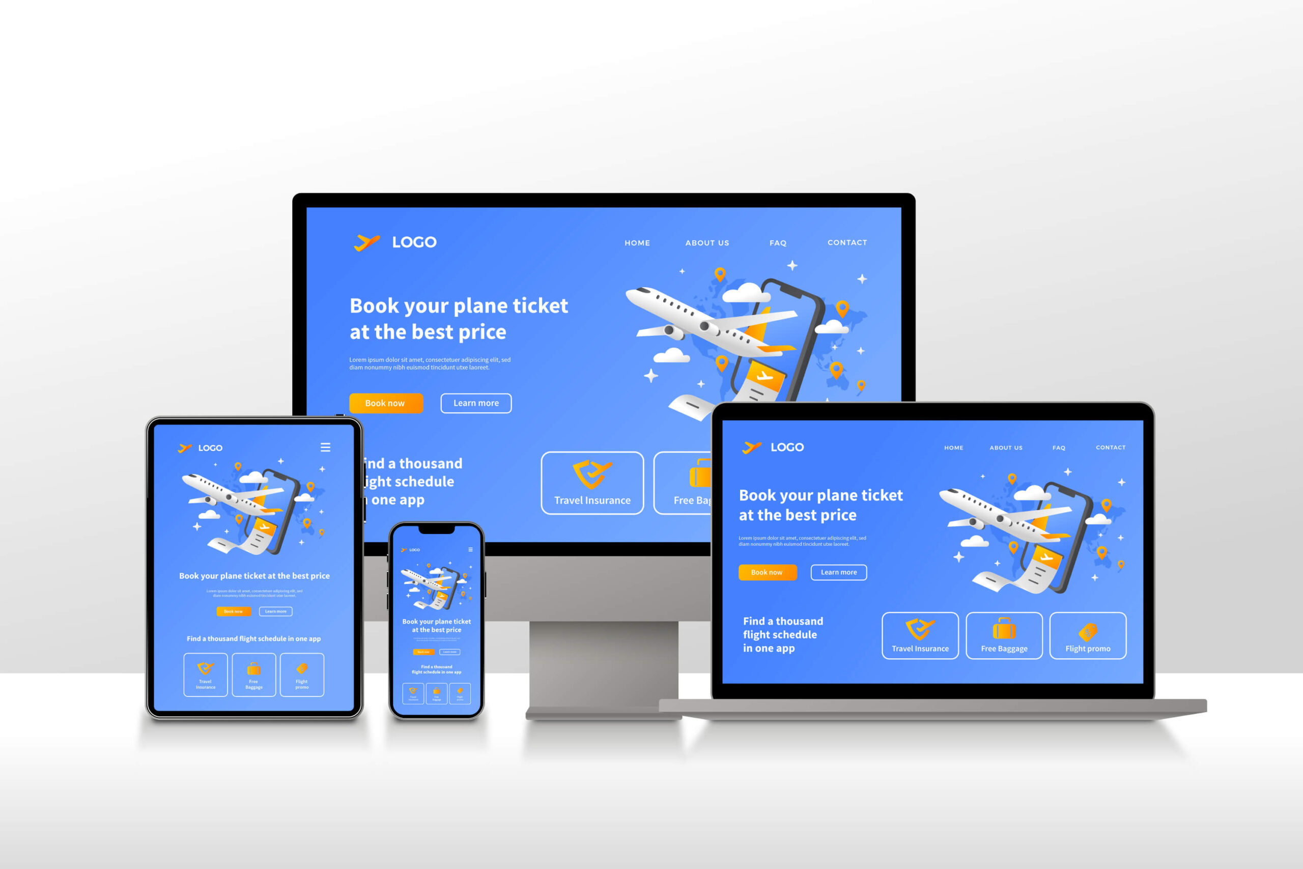
Mobile-first design isn’t just about making a website “responsive.” It’s a design approach that starts with mobile devices at the core. Instead of designing a large desktop layout and shrinking it down, you do the opposite. You build for the smallest screen first and scale up from there.
Why? Because designing for mobile forces you to focus on what matters most. Every pixel, every word, and every image must earn its place. It encourages cleaner layouts, faster performance, and simpler navigation.
For example, think about how users scroll on their phone. They use one thumb, they scan fast, and they expect quick results. A cluttered layout or slow-loading page breaks that flow instantly. Mobile-first design prioritizes those real-world user habits.
Why It Matters for Business Growth
People make buying decisions on their phones. Whether it’s a local restaurant, a B2B software company, or an online store, mobile plays a critical role in conversions.
Studies show that over 60% of global web traffic now comes from mobile devices. In some industries, that number is even higher. Google also uses mobile-first indexing, which means your mobile site—not your desktop version—is what determines how you rank in search results.
A mobile-first site doesn’t just look good on phones. It performs better everywhere. Cleaner code, faster load times, and more efficient layouts improve user experience across all devices. The result? Higher engagement, longer visits, and better SEO rankings.
When your website feels seamless on mobile, you earn trust. And trust converts into action—whether that’s a lead submission, an online purchase, or a phone call.
Common Mistakes Businesses Still Make
Even with all the data, many websites still fall short on mobile experience. Some of the most common issues include:
Text that’s too small to read
Buttons placed too close together
Heavy images that slow down loading
Pop-ups that cover the entire screen
Navigation that’s too complicated for thumbs
These might seem minor, but on a small screen, they create real friction. Users don’t give second chances. If your site is hard to use, they leave—often for a competitor whose mobile experience feels effortless.
A mobile-first mindset helps you eliminate that friction early. It makes you think like your user. What’s essential? What can be simplified? What makes someone stay, scroll, and take action?
How to Build a Mobile-First Website That Works
Building mobile-first doesn’t require a completely new process, but it does require a shift in priorities.
Start with content hierarchy. What do users need to see first? Headlines, calls to action, and navigation should be simple and clear.
Next, focus on page speed. Compress images, use lazy loading, and reduce unnecessary scripts. Mobile users expect instant responses. A one-second delay can drastically impact conversions.
Then, design for touch interaction. Buttons should be large enough for thumbs, and forms should be easy to complete without zooming in.
Finally, test constantly. Use tools like Google’s Mobile-Friendly Test or PageSpeed Insights to identify issues before launch. Real-world testing on multiple devices is even better. Check how your site feels on an iPhone, an Android, a tablet, and older devices too.
The SEO Advantage of Mobile-First Design
Search engines reward great user experiences. That’s why Google prioritizes mobile performance as a key ranking factor. A slow, clunky mobile site can hurt your SEO even if your desktop version is flawless.
Mobile-first design naturally aligns with SEO best practices. Faster loading, clear structure, and intuitive navigation all improve crawlability and user satisfaction. These metrics feed directly into your search rankings.
For local businesses, it’s even more important. Mobile users often search with intent—they’re looking for “near me” services, open hours, or quick contact options. If your site doesn’t load fast or show information clearly, those potential customers move on.
A well-built mobile-first site makes it easy for search engines and users to find what they need, fast.
Measuring Success After Going Mobile-First
Once you launch your mobile-first website, track how it performs. You’ll likely see improvements in several areas:
Lower bounce rates
Higher time on site
Better organic rankings
Increased conversions from mobile traffic
You can also measure micro-interactions. Are people scrolling further down the page? Are more visitors clicking your contact buttons? Small behavior changes add up to big results.
Remember, optimization doesn’t end at launch. Keep reviewing analytics, running A/B tests, and refining user experience. Your mobile visitors will keep evolving, and so should your site.
Key Takeaways
- Mobile-first design starts with mobile users at the core, not as an afterthought
- Google’s mobile-first indexing makes this approach essential for SEO
- Fast loading, clean layouts, and clear navigation drive engagement
- Designing for touch improves usability and conversions
- Continuous testing ensures your site stays optimized over time
Final Thoughts
Your customers are on their phones—on the train, at lunch, in line, everywhere. If your website isn’t built for them, you’re losing connection and credibility.
A mobile-first design doesn’t just future-proof your business. It creates a smoother experience for every visitor and strengthens your entire digital presence.
At BrandBolt, we help businesses build mobile-first websites that convert. Whether you need a redesign, faster performance, or improved usability, our approach ensures your site delivers results on every device.
How does your website feel on the phone right now? If it’s not effortless, it’s time to rethink your design.
Common Questions
What is the difference between responsive and mobile-first design?
Responsive design adapts to any screen size, while mobile-first starts from the smallest screen and scales up for larger ones.
How do I know if my site is mobile-friendly?
Use Google’s Mobile-Friendly Test or check your analytics. If mobile bounce rates are high, your site likely needs improvement.
Is mobile-first design more expensive?
Not necessarily. It’s a smarter approach that focuses on essentials, often reducing unnecessary features and costs.
How often should I update my mobile design?
Review performance every 12 months and consider a refresh every 2 to 3 years as user behavior and devices evolve.